

Elevate Digital
2025 Rebrand
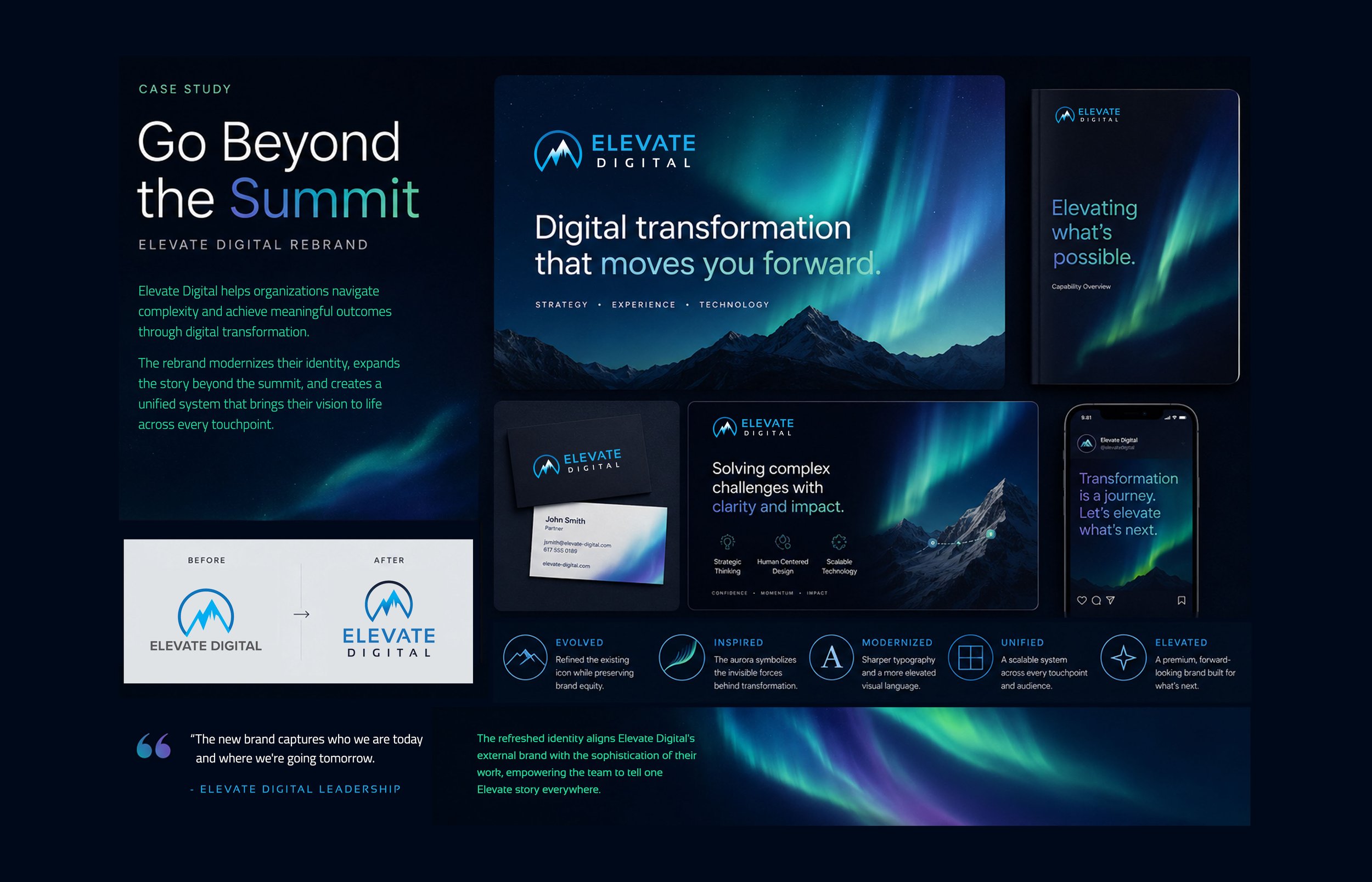
When Elevate Digital brought me in, they weren’t starting from scratch. They had a solid brand, but it felt stuck in another era. The palette leaned early-2010s tech, the typography felt slightly generic, and the identity wasn’t reflecting the level of work they were actually doing. They had already worked with multiple designers and firms to refresh it, but none of it felt right.
The challenge wasn’t to reinvent Elevate. It was to evolve it without losing what made it familiar.
As part of the rebrand, I modernized the logo while preserving its core shape, rebuilt the color system with more depth and energy, rethought the typography to feel cleaner and sharper, and introduced a new visual language inspired by the aurora. The aurora became the unlock. The mountain in their original mark represented ambition — the climb. But above the summit is where the real transformation happens.
Like digital systems, the aurora is invisible in structure but powerful in impact, turning complexity into clarity and motion.
That idea became a system. From there, I built out a full brand guide, presentation decks, social templates, business collateral, and a unified visual language across every touchpoint. The result? The team immediately embraced and adopted the new brand. The response was incredibly strong - clearer, more modern, and more aligned with who they are today.
This is the kind of work I love most: not just making something look better, but making it feel right.
Learn more about their rebrand here.